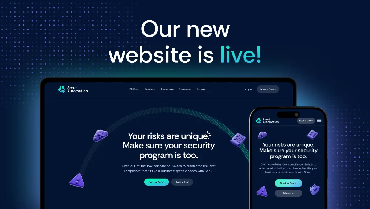


Come take a look at what’s changed.
You might’ve noticed we look a little different.
There’s a reason. We’ve given the Scrut website a makeover!
Over the past few years, the Scrut Platform has evolved.
From bare-bones SOC 2 automation tool to a full-fledged cyber-GRC platform built for security-conscious builders.
We’ve gained serious traction with companies in some of the most heavily regulated industries.
Scrut has helped over 1,500 companies, from scaling startups to established mid-market players, achieve risk-first compliance.
We shipped features that solved our customers’ unsaid pain points, quickly became the most beloved GRC platform on G2, and hit the top 5 on almost every software review website.
We needed our website to reflect that.
So, we rebuilt it from the ground up with sharper messaging, clearer paths for buyers, and fewer “solutions” no one asked for.
Our new site makes it easy for prospects to see how.
Why we needed a change
The old Scrut site got the job done.
However, as we added new features, reached larger customers, and operated at a new scale, the original site no longer reflected the future we were heading towards.
As Scrut grew, it became clear that the brand needed to grow too.
We needed a website that focused on our capabilities, talked clearly to our customers, and highlighted the impact Scrut made.
So, we gave Scrut.io a new coat of paint and a better story.
A site that mirrors what we’re building: confident, practical, and ready for scale. One that helped visitors understand our product, trust our vision, and take action.
What changed—and why
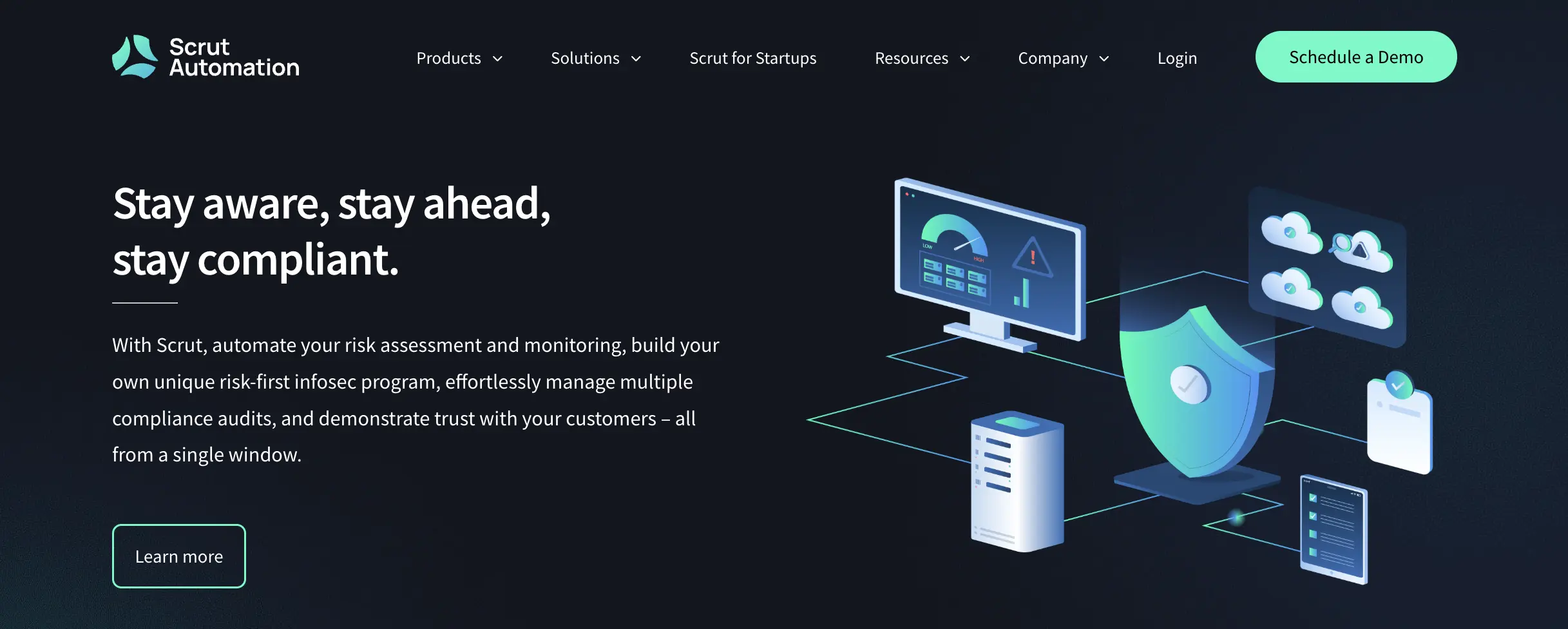
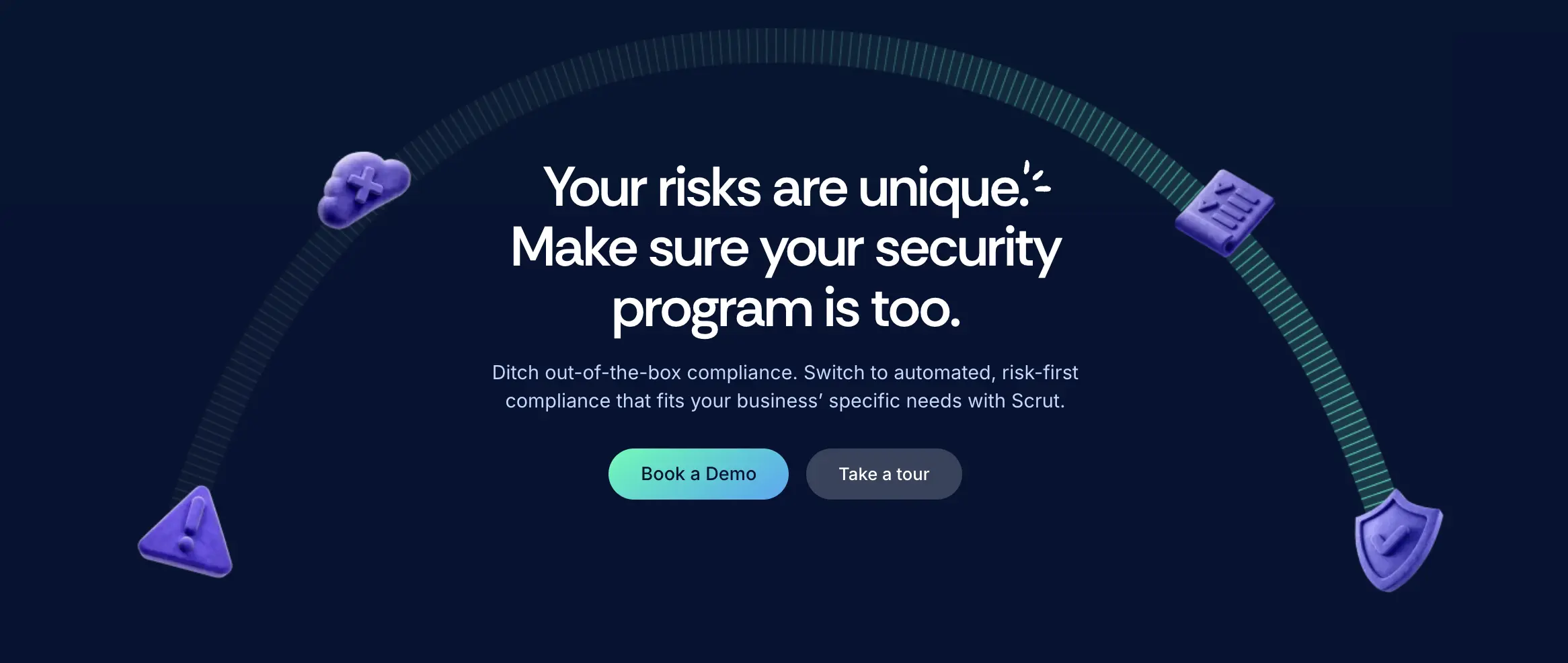
1. A sharper, more confident design system
We worked within our existing brand foundations, but gave them room to breathe.
Our risk-first thinking still made up the heart of Scrut, but with bolder layouts.
We still stood for strategic security, but with better type hierarchy.
Every visual decision was made to communicate authority and confidence while being warm and empathetic to each visitor’s situation.
We wanted to look trustworthy, not flashy.
So our color palette leans into mature neutrals and deep blues.
The accent colors bring energy without overpowering the eye.
It’s a site that reflects a team that knows what it’s doing.
2. Content that speaks to the right people (in the right words)
GRC tools and platforms make enough vague promises. Our verbiage cuts through the noise:
- Clear, not complicated.
- Straightforward, not stiff.
- Helpful, not hyped.
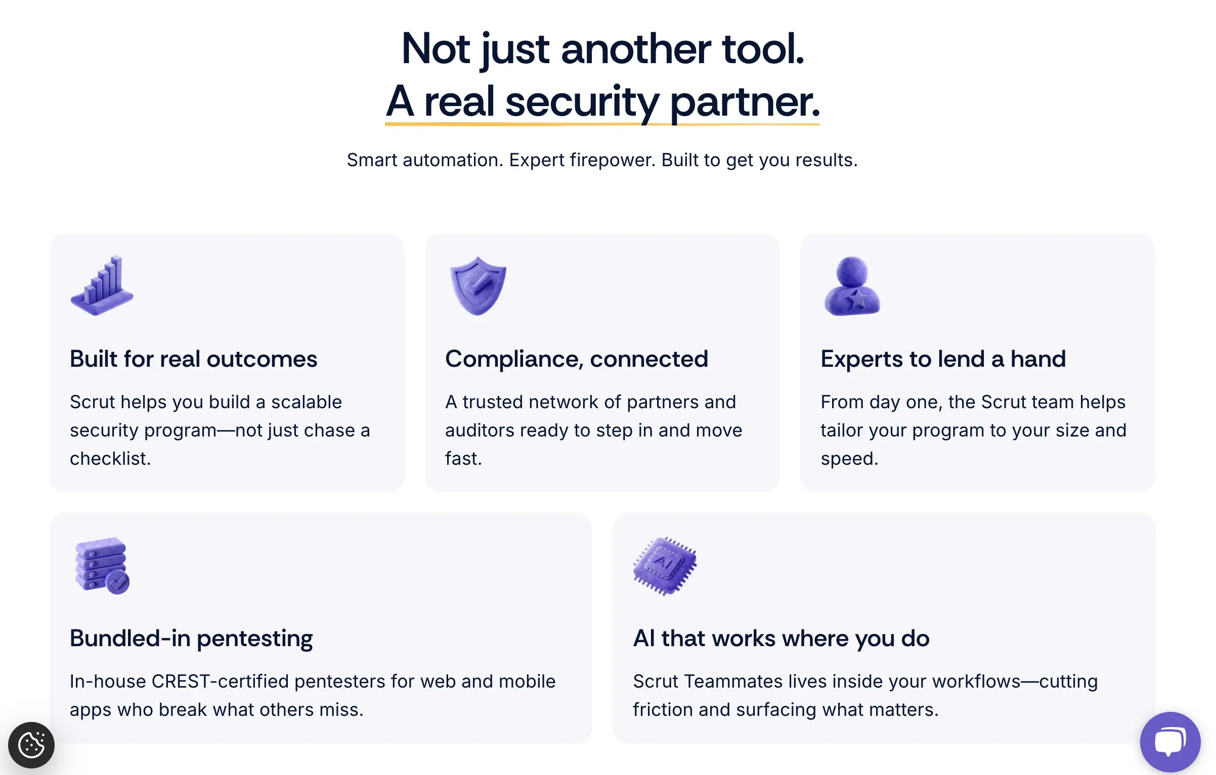
We restructured every page around real user questions:
→ What does Scrut do?
→ How does it fit into my workflow?
→ What frameworks does it cover?
→ What if I’m not a “compliance person”?
We also made space for deeper dives—new platform pages, industry guides, and framework explainers.
Whether you’re looking for SOC 2, ISO 27001, HIPAA, or a custom program across multiple subsidiaries, the new Scrut.io shows you how to get there—fast.
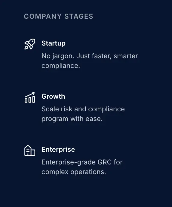
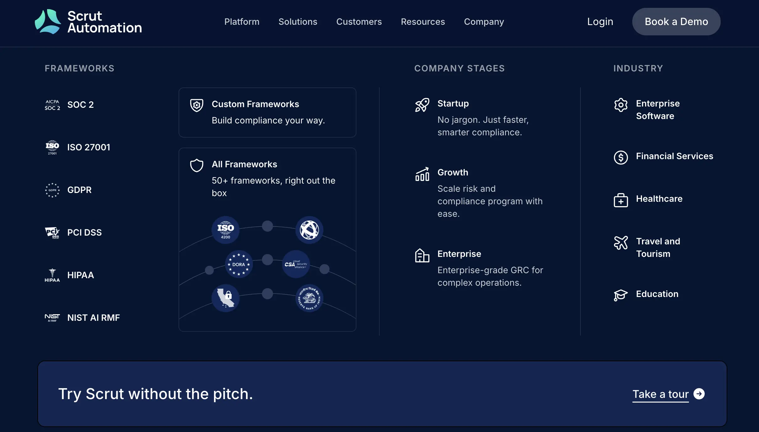
3. Pages that match the scale we’ve achieved
We expanded the site so you can see right away if Scrut fits your team.
We made it easier to explore how Scrut works for your specific use case, whether you’re here for early audits or enterprise risk ops.
- Industries: We create tailored experiences for high-stakes, regulated sectors like healthcare, fintech, SaaS, and education.
- Company stages: Whether you’re in scrappy scale mode or optimizing a mature program, the site adapts to your context.
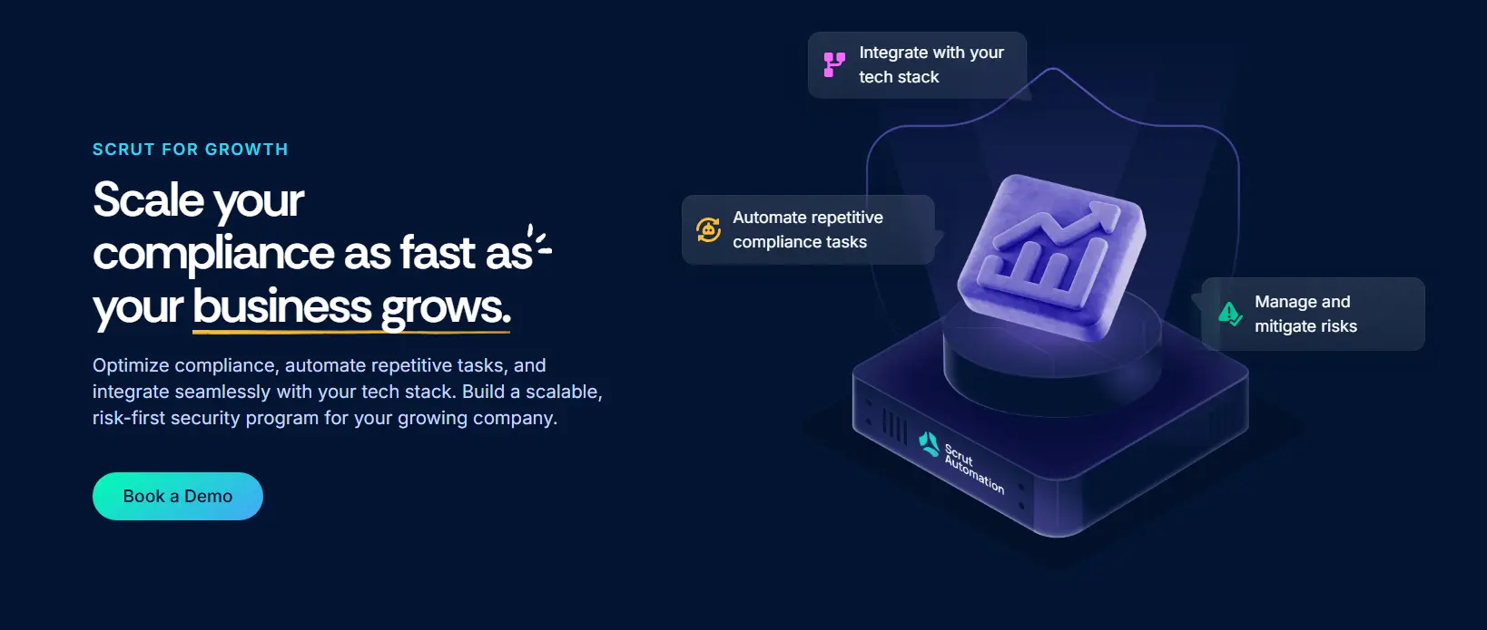
- Frameworks: We support 50+ frameworks and custom ones too—but you wouldn’t have known that before. So we fixed it.
Now there's one place to browse them all, plus dedicated pages for the ones you care about most.
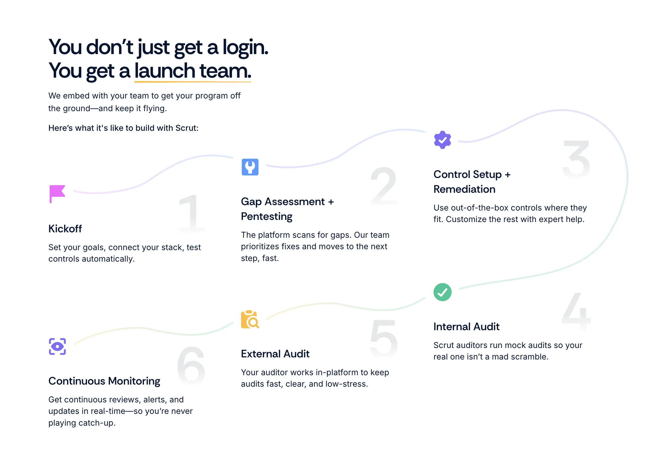
4. A product experience before you even sign in
We didn’t want the only way to get a feel for the platform to be a sales call.
So we built the site that gives you a transparent, honest look at the product right from the homepage.
- Walkthroughs let you try before you buy.
- Product flows show how everything works, step by step.
- Gifs, visuals, and screenshots highlight every capability in action.
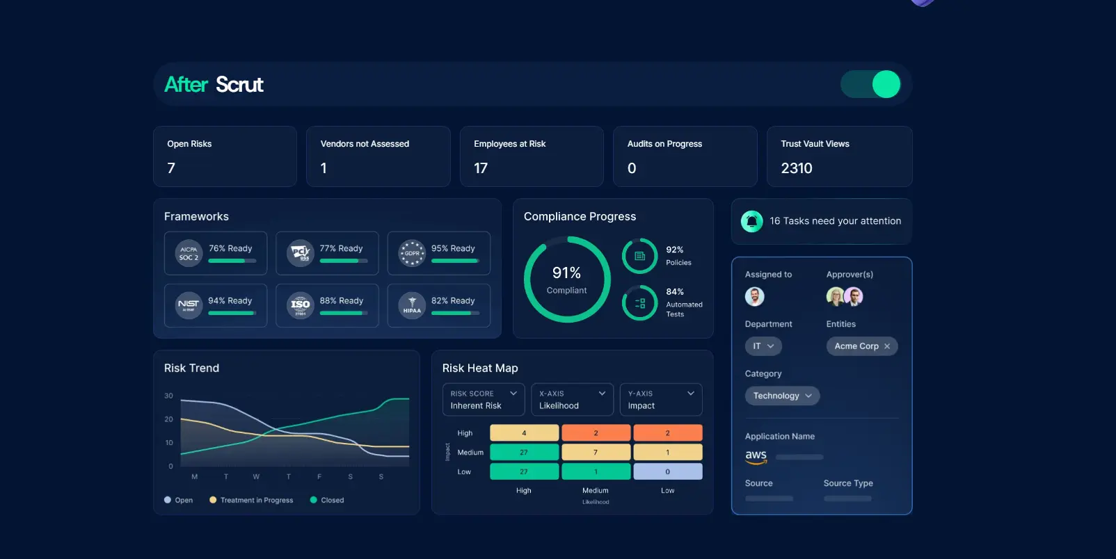
You see how workflows actually work. How controls get mapped. How reports are generated. It’s all there, so you can decide faster.
Whether you’re curious, comparing, or ready to dive in, Scrut doesn’t hide behind vague promises.
It shows you what you’ll get.
5. Microinteractions that mirror product quality
The new site doesn’t just look better—it moves better too.
- Intentional animations guide the eye, reduce friction, and create rhythm.
- Smart hover states and CTAs make it easy to explore without cognitive overload.
- Thoughtful transitions create a smooth, responsive experience that echoes how Scrut feels to use.
Everything is designed to feel familiar—from colors to layout—because it’s all inspired by the platform itself.
6. More trust, front and center
Compliance is about trust.
With years of experience behind us, we wanted the new site to reflect that depth of trust our customers place in us—right from the first scroll.
We’ve always taken trust seriously—it’s kind of the whole point of what we do.
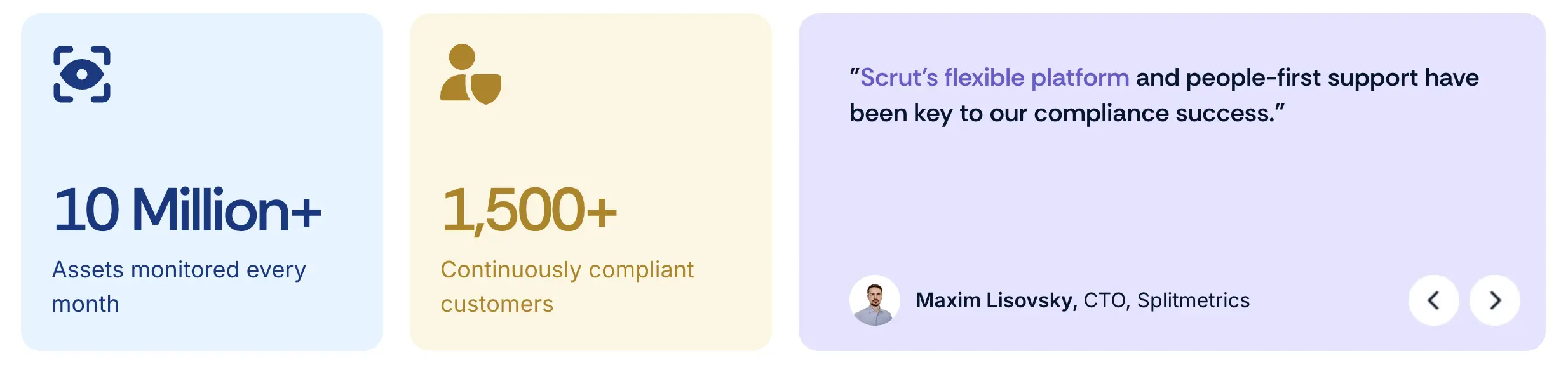
With the revamp, we brought it all front and center.
Case studies now show how teams like yours scale with Scrut.
Impact metrics are where they matter and social proof where you need it.
The Trust Vault is easier to find (and use).
We even pulled up things like AI FAQs, platform walkthroughs, and our security commitments.
All this so you can get a clear sense of what working with us looks like—without sitting through a sales call.
If you’ve been here before, you’ll notice: we’re not just saying “trust us” anymore.
We’re making it obvious why you can.
After months of brainstorming: A website that reflects our product, our people, and our point of view
We ticked off some goals for our new website!
✅ Building a clear narrative
GRC can be confusing.
We wanted the site to speak to every type of visitor.
From the startup founder who just heard about ‘SOC 2’ for the first time to the seasoned CISO looking to modernize their processes, and everyone in between.
So we stripped away the jargon and focused on clarity—what Scrut does, why it matters, and how it’s different.
✅ Making the site as usable as the platform
We rebuilt the site to be as intuitive to use as the platform itself.
That meant faster navigation through a simplified nav bar and clearer content to guide every step.
And we made sure there are no dead ends, just smooth paths that lead visitors forward.
No matter if you're here to explore frameworks or dig into platform details, everything’s easier to find and understand.
✅ Bringing our brand to life
Trust, speed, clarity, and flexibility are at the heart of the Scrut Platform. Now, they are central to the Scrut website too.
What this means for Scrut (and for you)
We’re proud of where the product is. We’re proud of the teams who’ve built it and the customers who’ve shaped it.
This new website is an extension of all that.
It’s a home base for our platform, our philosophy, and our people. It’s built to scale with our growth and help others scale too.
Most importantly? It’s not just for us—it’s for you.
Whether you're on your first audit, building a multi-entity GRC strategy, or just exploring what’s next, we hope the new Scrut.io makes that journey clearer, faster, and a lot less painful.


.png)